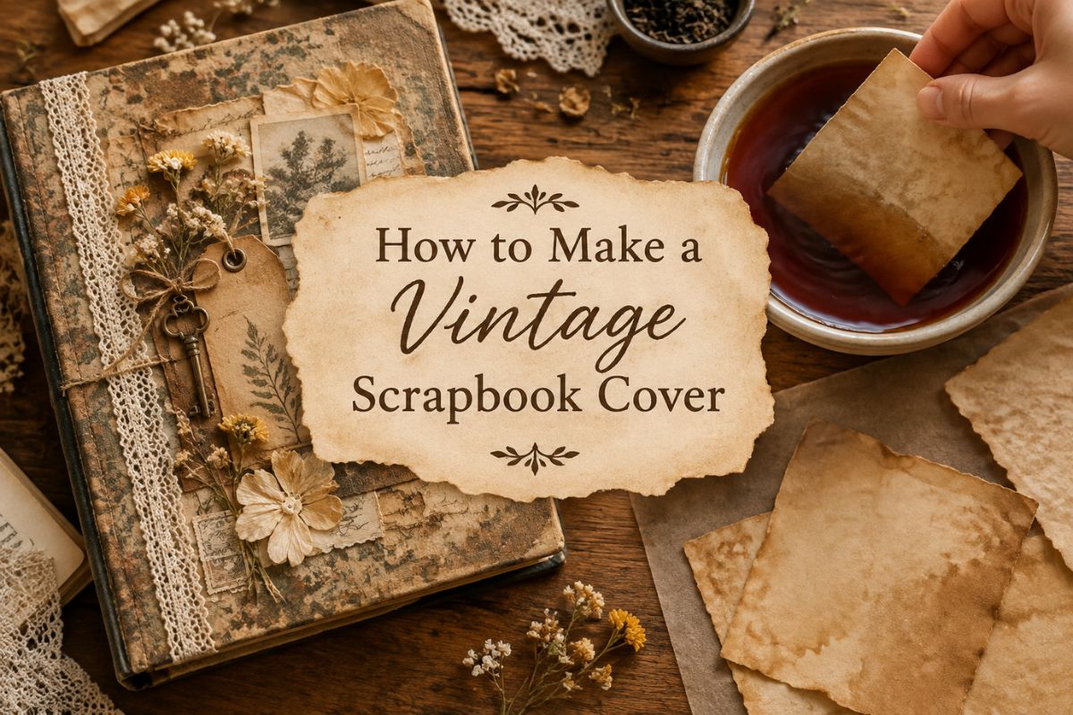
Vintage Scrapbook Cover: 4 Simple DIY Techniques for a Lived-In Look Without Expensive Antiques
A vintage scrapbook cover is the first thing anyone sees before they even open the album, and it sets expectations for everything inside. A plain, unremarkable cover on an album full of carefully curated pages feels like a mismatch — like wrapping a handwritten letter in a printer-paper envelope. The good news is that a genuinely beautiful, vintage-feeling cover doesn’t require expensive materials or advanced craft skills, just a handful of simple techniques used with intention.
What Actually Makes a Cover Feel Vintage
Vintage isn’t really about age — it’s about texture and imperfection. A crisp, flat, perfectly clean surface reads as modern no matter what colors or imagery you put on it. A cover with visible texture, slightly uneven edges, and layered materials reads as vintage almost automatically, even using materials bought yesterday.
That’s genuinely good news if you’re just starting out — the “aging” techniques that create this look are simple, forgiving, and hard to mess up badly. A slightly uneven tea stain looks intentional. A perfectly even one looks like it came from a printer.
Materials Worth Having on Hand
You don’t need all of these for a single cover, but having a small stock of each makes it much easier to reach for whatever a specific project needs.
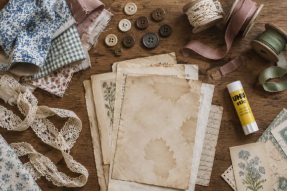
- A sturdy base — chipboard, cardstock, or an old book cover repurposed as a foundation. This needs to hold up to gluing and handling without warping.
- Fabric scraps — linen, cotton, or lace remnants add texture that paper alone can’t replicate. Even a small strip used as an accent goes a long way.
- Aged or printed paper — tea-stained paper, old book pages, or printable vintage-style paper designed to look aged already.
- Ephemera — old stamps, ticket stubs, ribbon, buttons, small charms. These are what give a cover a collected, layered feeling rather than a single flat design.
- A strong adhesive — a good glue stick for paper, and a stronger craft glue for fabric or heavier embellishments that a glue stick won’t hold.
Simple Techniques That Do Most of the Work
Tea or Coffee Staining
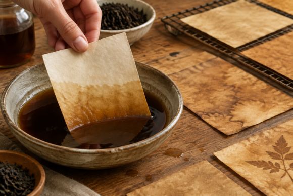
Brew tea or coffee stronger than you’d actually drink it, let it cool slightly, and either dip paper briefly or brush it on with a wide brush. The staining effect comes from tannins naturally present in black tea, which is exactly what gives this vintage scrapbook cover technique its warm, aged tone. Let it dry flat or slightly crumpled for more texture in the aging. This single technique instantly ages plain white paper into something that looks decades old.
Layering, Not Flattening
Resist the urge to glue everything perfectly flat. Slightly overlapping edges, a corner that lifts just a little, a ribbon that isn’t pulled perfectly taut — these small imperfections are what separate a handmade cover from a printed one. Real vintage materials were never perfectly flat to begin with.
Edge Distressing
Lightly sanding or tearing (rather than cutting) the edges of paper elements gives them a worn, handled quality. A straight scissor-cut edge reads as new no matter how aged the paper itself looks — the edge treatment matters as much as the material.
A Focal Point, Not Full Coverage
A common mistake is covering every inch of the cover with decoration. A strong cover usually has one clear focal point — a central image, a cluster of ephemera, a title — with the rest of the space left calmer around it. Busy-everywhere covers tend to feel chaotic rather than rich.
Putting It Together
Start with your base and decide on the overall color story before gluing anything down — lay pieces out loosely first and step back to see the whole composition. Build from the bottom layer up: base paper or fabric first, then larger ephemera, then smaller accent pieces last. Let each layer dry before adding the next, especially with fabric, which needs more time and stronger glue than paper alone.
Once everything is placed and dry, a light coat of matte sealant protects the surface without adding an artificial shine that would undercut the aged look you just spent time creating.
Where Printable Paper Fits In
Not every element needs to be genuinely vintage or hand-aged — printable paper designed to already look aged, floral, or textured can fill in gaps quickly without needing to source real antique materials. Print a sheet, tear or distress the edges the same way you would real paper, and it blends in naturally alongside the handmade pieces.
A Good Starting Point
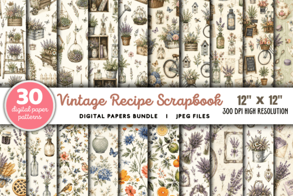
Printable vintage-style paper patterns give you a fast, ready-to-distress base layer without needing to source or age real antique paper yourself. Print, tear the edges, and layer it in alongside your other materials.
If you’d rather not piece together fabric, ephemera, and paper separately, a coordinated scrapbook bundle gives you several of these materials already designed to work together — paper, stickers, tags, and small embellishments built around one cohesive theme, ready to layer straight onto your cover.
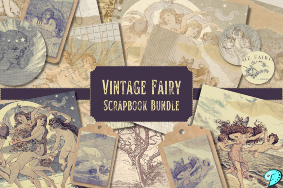
This bundle in particular is designed to work across scrapbooking, journaling, and junk journaling alike, which makes it especially useful for a cover project pulling in more than one material type at once.
Final Thoughts
A vintage scrapbook cover doesn’t need expensive antiques or advanced skills — it needs texture, a little imperfection, and a clear focal point instead of decoration crammed into every corner. Start with a simple tea stain and one strong layered element, and you’ll already be closer to that lived-in, collected look than a dozen perfectly flat embellishments would get you.
You May Also Like
This post contains affiliate links. If you buy through them, we may earn a small commission at no extra cost to you. Learn more.