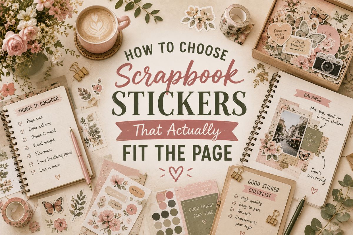
How to Choose Scrapbook Stickers That Genuinely Fit the Page
A scrapbook page without any decoration tends to read as a photo dump — pictures taped down with no sense of when, where, or why they mattered. Stickers are usually the fastest way to fix that, but picking them by “cute vs not cute” misses the actual decision that matters: does this sticker tell the same story as the photos it’s sitting next to.
Choosing Scrapbook Stickers: Theme First, Aesthetic Second
Most people start by browsing for a look they like — florals, pastels, whatever’s trending — before thinking about what the page is actually about. That order tends to backfire. A gorgeous sticker set that has nothing to do with the event it’s decorating ends up feeling generic no matter how nice it looks on its own.
Starting with the theme instead — a trip, a birthday, a season, a specific person’s page — narrows things down fast, and usually still leaves room to pick an aesthetic you like within that theme. A travel page can be minimalist or maximalist. A baby page can be soft pastel or bold and graphic. The theme sets the subject; the aesthetic sets the mood.
Matching Stickers to Common Scrapbook Themes
A few of the most common scrapbook subjects, and what actually works well for each.
Travel
Maps, landmarks, transportation icons, and location-specific imagery ground a travel page in an actual place rather than a generic vacation. Specificity matters more here than almost any other theme — a sticker of the actual city or country you visited beats a generic airplane icon every time.
Baby & Milestones
Soft, simple imagery — footprints, small animals, gentle color palettes — tends to outlast trendier styles better than bold or novelty designs, since these are pages people tend to revisit for years. Milestone-specific stickers (first steps, first tooth, a specific age) add more meaning than generic “baby” decoration.
Seasonal & Holiday
These are the easiest to get specific with, since the season itself does a lot of the storytelling — pumpkins and warm tones read as fall instantly, without needing a caption to explain it. The risk is leaning too generic; a specific holiday tradition sticker tends to hold more meaning than a broad “winter” theme.
Everyday Life
Not every page documents a big event — coffee, weekend routines, a specific hobby. These benefit from stickers tied to the actual activity rather than generic decorative filler, since the specificity is often the entire point of documenting an “ordinary” day at all.
Vintage vs. Modern Aesthetic
Once the theme is settled, choosing the right scrapbook stickers usually comes down to one core aesthetic choice: nostalgic or current.
Vintage-style stickers — faded colors, aged textures, antique-style illustration — work well for pages meant to feel timeless, like family history, weddings, or anything with a nostalgic tone regardless of when it actually happened. They also tend to age better visually than trend-driven styles, since “vintage” doesn’t go out of style the way a specific modern trend eventually does.
Modern or trendy stickers — clean lines, current color palettes, whatever aesthetic is popular right now — capture a specific moment in a different way, reflecting the actual era the page was made rather than an imagined older one. There’s nothing wrong with a page looking like it was made in the year it was made.
Neither is more “correct” — it depends on whether you want the page to feel like a snapshot of right now, or something that could have been made decades ago.
A Few Practical Tips
A few final things matter when picking scrapbook stickers for the page in front of you, beyond just theme and aesthetic.
- Pick one dominant color story per page rather than mixing several unrelated palettes — it’s the fastest way to make a page look intentional instead of cluttered.
- Leave room for the photos to breathe — stickers should frame and support the pictures, not compete with them for attention.
- Save a few plain, versatile stickers alongside the theme-specific ones, for small gaps or details a themed set doesn’t cover.
Find the Right Ones
Depending on whether your page needs a nostalgic feel or something more current, we’ve rounded up two full sets worth browsing — one leaning vintage and aesthetic, the other covering general printable themes across seasons, moods, and occasions.
A Good Starting Point
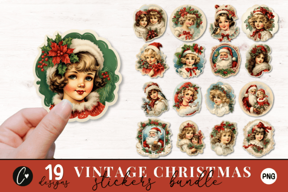
Old-fashioned ornaments and muted, faded tones instead of the bright, glossy look most seasonal sticker sets default to — the kind of vintage specificity that makes a holiday page feel like a memory rather than a mall display. A good example of choosing a mood over just a generic seasonal theme.
Final Thoughts
The best scrapbook stickers aren’t the ones that look nicest in a preview image — they’re the ones that actually match what the page is about. Start with the theme, choose vintage or modern based on the mood you want, and let the photos stay the real focus rather than competing with the decoration around them.
This post contains affiliate links. If you buy through them, we may earn a small commission at no extra cost to you. Learn more.